The Starting Question
"How strong could the wind get? How high could the flood rise?"
As engineers designing power lines, substations, or any infrastructure, we face a fundamental problem: we need to build things that can survive extreme weather. But extreme events are rare by definition - we might only see a really bad storm once every 50 years. So how do we plan for something we've rarely (or never) seen?
This is where our journey begins.
Step 1: Collect Data and Look for Patterns
What we do: We gather years of weather data - say, 30 years of daily maximum wind speeds.
What we observe: Most days have normal wind. But occasionally, there's a big spike - a storm. These spikes are what we care about.
The first insight: Regular statistics (like averages) don't help us much here. The average wind speed tells us nothing about the worst wind speed. We need math specifically designed for the "tails" of the distribution—the rare, extreme events.
Branch: There are two main approaches to extract extreme data:
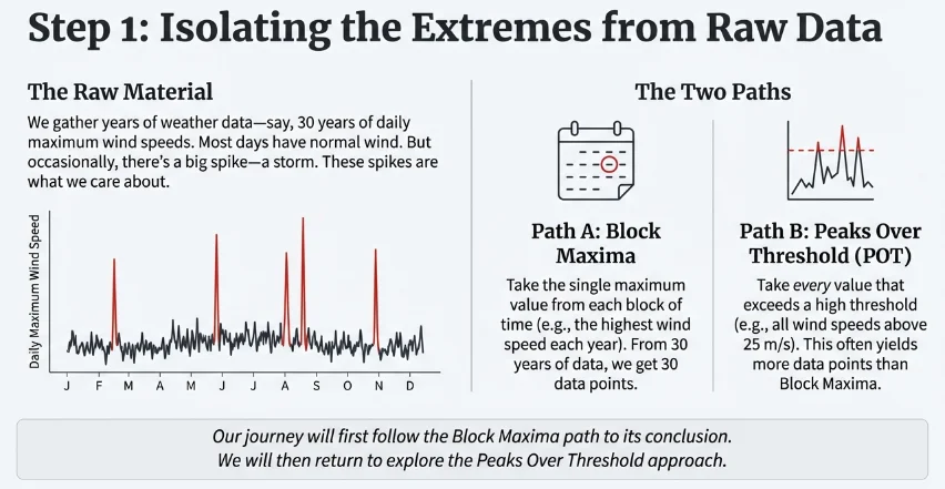
We'll follow the Block Maxima path first, then come back to the threshold approach.
Step 2: Model the Extremes → The GEV Distribution
The question: Is there a mathematical formula that describes how extreme values behave?
The discovery: Statisticians proved something remarkable called the Fisher-Tippett-Gnedenko theorem—no matter what the original data looks like (temperature, wind, rain, floods), when you take the maximum of many observations, it always converges to one of three patterns. These three types were unified into the Generalized Extreme Value (GEV) Distribution.
This is powerful: whether you're analyzing river floods, stock market crashes, or hurricane winds, the same mathematical family applies.
The Formula:
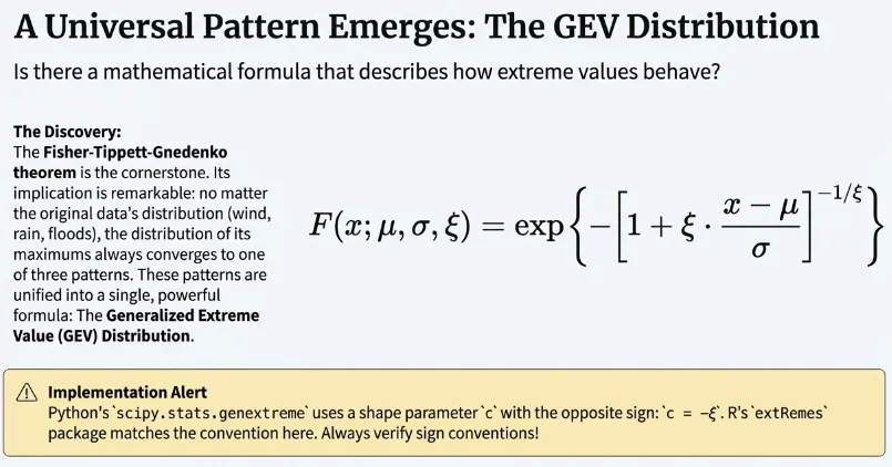
What the parameters mean:
| Parameter | Name | What it controls |
|---|---|---|
| μ (mu) | Location | Where the distribution is centered |
| σ (sigma) | Scale | How spread out the values are |
| ξ (xi) | Shape | How "heavy" the tail is—this is the crucial one |
The three types (determined by ξ):
- ξ > 0 (Fréchet): Heavy tail that never ends. Extreme events can get arbitrarily large. Think of flood levels—there's no theoretical maximum.
- ξ = 0 (Gumbel): A "light" tail. Extreme events are bounded but only logarithmically. Common for temperature extremes.
- ξ < 0 (Weibull): There's an absolute upper limit. Think of wave heights in a closed bay—there's a physical maximum.
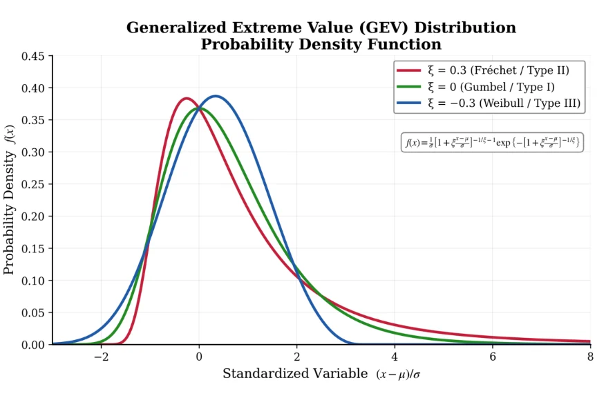
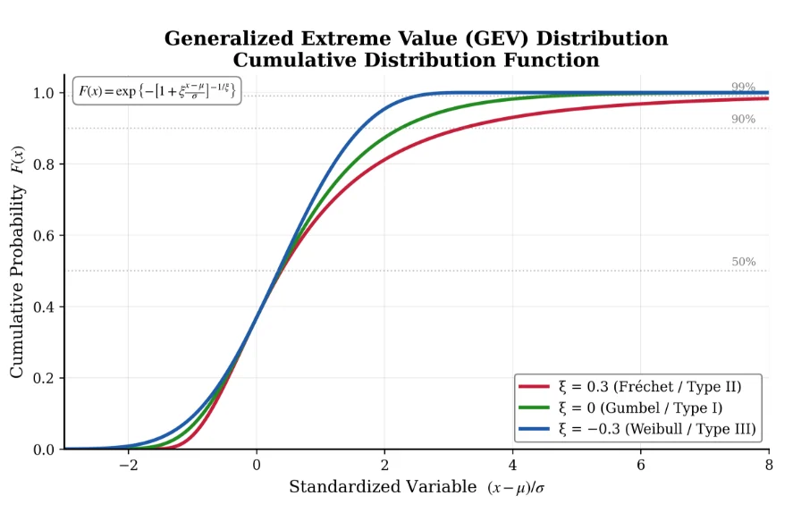
How to read the PDF graph: The y-axis shows probability density—higher means more likely. The Fréchet curve (ξ > 0) extends much further right, meaning very extreme values are more probable compared to the Gumbel or Weibull cases.
Step 3: Ask Practical Questions → Return Levels
The problem: The GEV formula is nice, but it is not intuitive to think of "probability distributions." Engineers ask: "What's the worst wind speed we might see in the next 100 years?"
The concept: This is called the Return Level. The T-year return level (z_T) is the value that gets exceeded, on average, once every T years.
The Formulas:
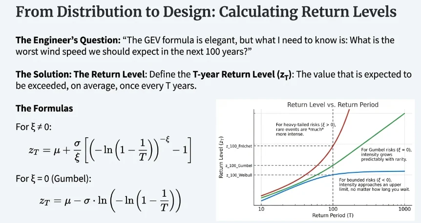
How to understand this:
Looking at a "Return Level vs Return Period" plot:
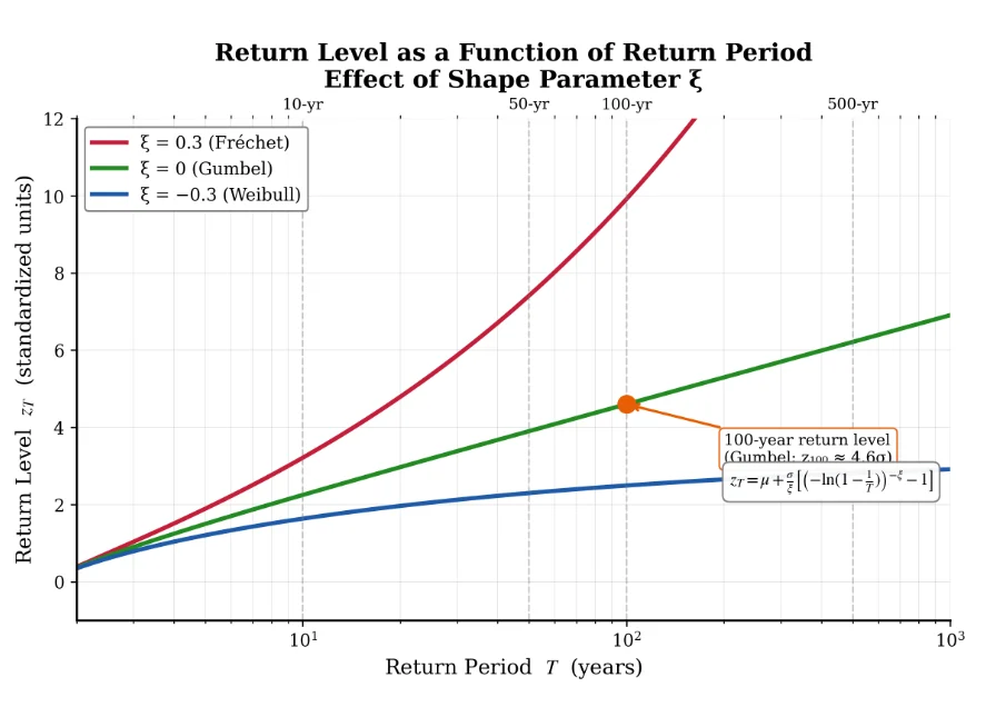
- The x-axis is the return period (how rare the event is)
- The y-axis is the intensity (how strong the event is)
- Each curve shows how return levels grow as we consider rarer events
Key insight from the graph:
- The Fréchet curve (ξ > 0) shoots upward—for heavy-tailed distributions, very rare events can be much more intense
- The Weibull curve (ξ < 0) flattens out—there's an upper limit no matter how long you wait
- The Gumbel curve (ξ = 0) grows steadily but not explosively
Practical example: For a Gumbel distribution with μ=0, σ=1, the 100-year return level is about 4.6 units. This means there's a 1% chance each year of exceeding 4.6.
What does "4.6 units" actually mean in the real world?
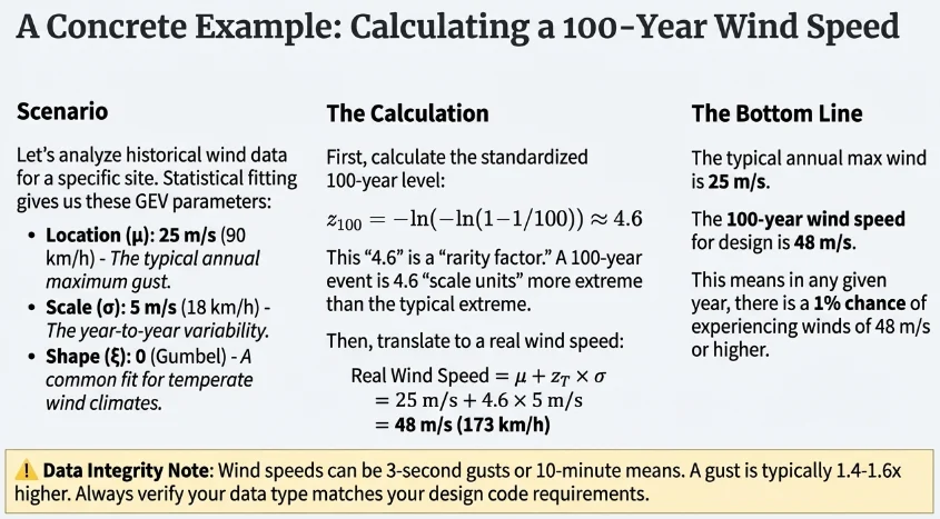
Let's make this concrete with an illustrative example. Suppose we analyze historical wind data for a region and find:
- Location parameter (μ): 25 m/s (90 km/h) — this is roughly the "typical" annual maximum wind gust
- Scale parameter (σ): 5 m/s (18 km/h) — this captures year-to-year variability
- Shape parameter (ξ): 0 (Gumbel distribution fits well for many temperate climate wind regimes)
Note: These are illustrative parameters for educational purposes. Actual GEV parameters should be fitted from local weather station data using proper statistical methods. Research on Canadian meteorological stations indicates the Gumbel distribution (ξ ≈ 0) is appropriate for approximately 70% of locations (Hong et al., 2014).
Wind Speed Measurement Types: Wind speeds can be reported as 10-minute means, hourly means, or 3-second gusts. These are NOT interchangeable—a 3-second gust is typically 1.4-1.6× higher than the 10-minute mean. Always verify which measurement type your data represents and what your design code requires.
The "4.6 units" from the standardized graph translates to real wind speed like this:
Real wind speed = μ + z_T × σ = 25 + 4.6 × 5 = 48 m/s (173 km/h)
So what does this tell us?
- A region might typically experience annual maximum wind gusts around 25 m/s (90 km/h)
- The 100-year return level is 48 m/s (173 km/h)—this is the wind speed we expect to be exceeded only once per century on average
- If the region experienced a 40 m/s (144 km/h) wind event last year, the chance of experiencing an even stronger event of 48 m/s (173 km/h) or higher in any given year is about 1%
- Over a 50-year planning horizon, there's roughly a 40% chance (1 − 0.99^50) of seeing at least one 100-year wind event
The multiplier (4.6) is essentially a "rarity factor"—it tells you how many standard deviations above the typical extreme you need to go to reach a once-per-century event. A 10-year event might only be 2.3 units above μ, while a 500-year event might be 6.2 units above.
Recap:
Understanding Uncertainty in Return Level Estimates
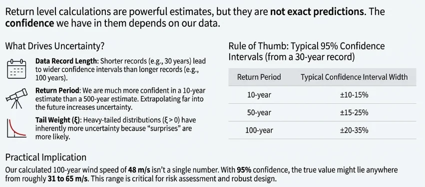
Return level estimates are not exact—they come with inherent uncertainty that increases with:
- Shorter data records (30 years vs. 100 years)
- Longer return periods (100-year vs. 10-year)
- Heavier-tailed distributions (ξ > 0)
For a typical 30-year record, approximate 95% confidence intervals are:
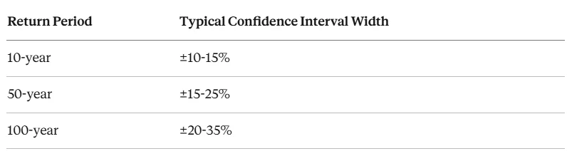
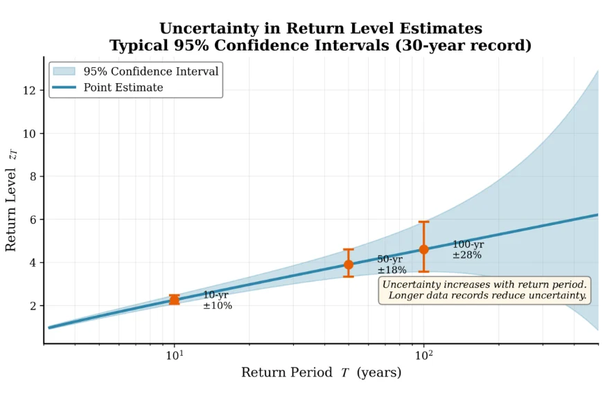
This means a calculated 100-year wind speed of 48 m/s might actually range from roughly 31-65 m/s at 95% confidence. Profile likelihood or bootstrap methods should be used for rigorous uncertainty estimation.
Recap:
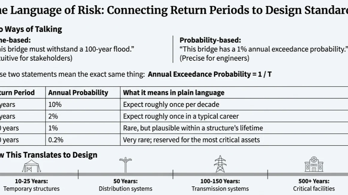
The Return Period ↔ Probability Connection:
Why do we need this relationship? When engineers and planners discuss infrastructure resilience, they often switch between two ways of talking about the same thing:
- Time-based language: "This bridge should withstand a 100-year flood"
- Probability-based language: "This bridge has a 1% annual failure probability from flooding"
These are saying the exact same thing! The return period is simply a more intuitive way to communicate probability to non-statisticians. Saying "100-year event" is easier to grasp than "0.01 annual exceedance probability."
This shows a simple but crucial relationship:
Annual Exceedance Probability = 1/T
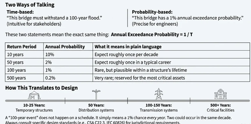
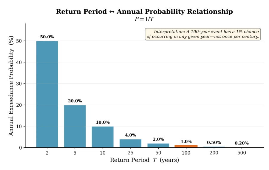
How engineers use this: Different infrastructure types are designed for different return periods based on consequences of failure. General utility practice typically follows guidelines like:
- Distribution systems: 50 year events (balance of cost and reliability)
- Transmission systems: 100-150 year events (higher consequence of failure)
- Critical facilities: 500+ year events (catastrophic failure consequences)
Note: Specific design return periods vary by jurisdiction, regulatory requirements, and utility policy. Always consult applicable design standards (such as CSA C22.3, IEC 60826, or local building codes) for specific requirements.
Common misconception: A "100-year event" doesn't mean it happens exactly once per century. It means each year has a 1% chance. You could get two 100-year events in the same decade (unlucky!) or none for 200 years (lucky!).
Step 4: Alternative Approach → Peaks Over Threshold (GPD)
The problem with Block Maxima: We're only using one data point per year. If we have 30 years of data, we only have 30 extreme values to fit our model. That's not much! As Coles (2001) notes, "A disadvantage of the GEV is the potential loss of data associated with block maxima modeling."
The insight: What if we used all the extreme events, not just the annual maximum? In a year, we might have 5 major storms - why throw away 4 of them?
The approach: Set a high threshold (u). Use every observation that exceeds this threshold.
The Generalized Pareto Distribution (GPD):
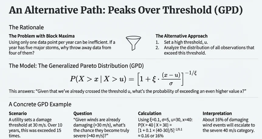
Practical Note on Threshold Selection: Choosing the threshold u is crucial for GPD analysis.
A concrete example to understand GPD:
Imagine you're a utility engineer analyzing wind damage risk. You set a "damage threshold" at 30 m/s (108 km/h)—winds above this level start causing significant damage to distribution infrastructure.
Looking at the past 10 years of data, you find that winds exceeded 30 m/s (108 km/h) on 15 separate occasions (some years had multiple events, some had none). This is much more data than just 10 annual maxima!
Now the GPD helps answer questions like:
"Given that we've already experienced 30 m/s (108 km/h) winds multiple times, what's the probability of experiencing 40 m/s (144 km/h) or higher in future events?"
Using GPD with typical parameters for temperate climates (σ = 5 m/s, ξ = 0.1):

This means: Among wind events that exceed your damage threshold of 30 m/s (108 km/h), about 16% will be severe enough to reach 40 m/s (144 km/h) or higher.
Taking it further: What about 45 m/s (162 km/h) - truly destructive winds?

About 7% of damaging wind events will reach this catastrophic level. This helps utilities prioritize: most storm responses deal with moderate damage, but crews should be prepared for the occasional severe event.
Reading a GPD exceedance plot, step by step:
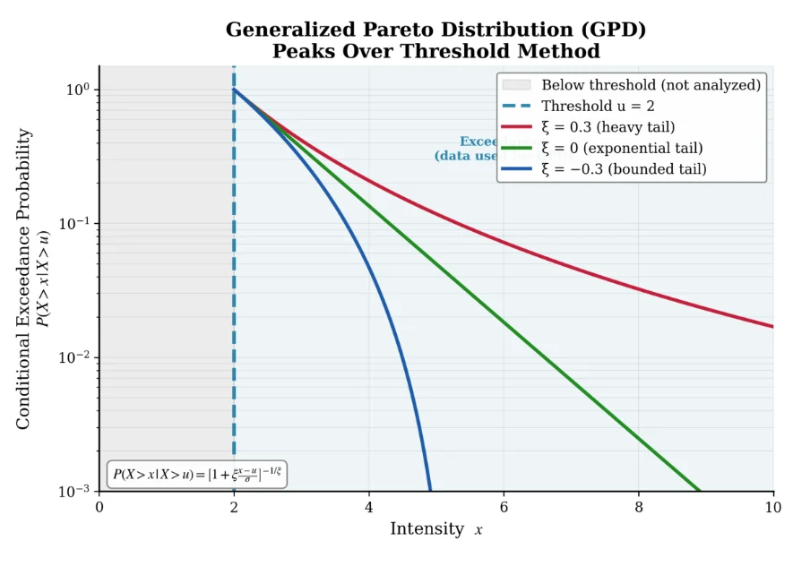
Step 1: Understanding the threshold line
- A vertical line marks the threshold u
- In our wind example, think of this as the "damage threshold" of 30 m/s (108 km/h)
- Everything to the LEFT of this line is "normal weather"—we ignore it for extreme value analysis
- Everything to the RIGHT is what we care about—these are the exceedances
Step 2: Understanding the exceedance region
- The region above the threshold contains ALL the data we analyze with GPD
- In practice, this might be 15-50 events over 10 years, instead of just 10 annual maxima
- More data = better statistical estimates = more confidence in our predictions
Step 3: Understanding what the curves show
- Start at the threshold (30 m/s in our example)—probability is 1.0 (100%)
- This makes sense: given you've exceeded the threshold, you've definitely exceeded the threshold!
- As you move right (higher intensity), the probability drops
- The question is: how fast does it drop? This depends on ξ, and this is where the three curves differ dramatically
Step 4: Comparing the curves—what do the different decay patterns mean in plain language?
- ξ > 0: Slow decay—"Expect the unexpected"
- ξ = 0: Exponential decay—"Predictable extremes"
- ξ < 0: Hits zero at a finite point—"There's a ceiling"
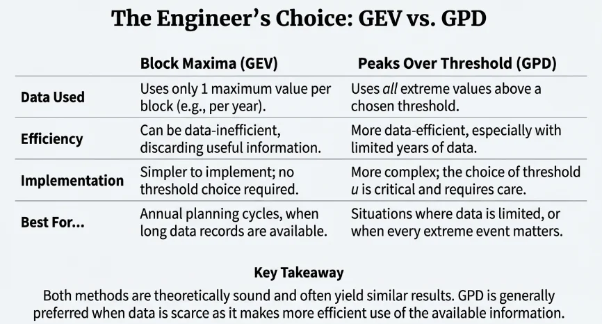
Branch comparison: GEV vs GPD
Step 5: Design Application → Hazard Curves
The final question: How do we turn all this math into engineering design decisions?
The tool: The Hazard Curve - a graph that directly answers: "What's the annual probability of experiencing intensity level X?"
The Formula:
H(IM) = P(IM > im) = 1 − F(im)
What is F(x)? This is the Cumulative Distribution Function (CDF)—it answers: "What's the probability that the value is less than or equal to x?" Mathematically, F(x) = P(X ≤ x), also called the non-exceedance probability.
For example, if F(40 m/s) = 0.95, this means: "There's a 95% chance the annual maximum wind will be 40 m/s (144 km/h) or below."
What is H(x)? This is simply the complement—it answers: "What's the probability that the value exceeds x?"
H(x) = 1 − F(x)
If F(40 m/s) = 0.95, then H(40 m/s) = 1 − 0.95 = 0.05, meaning: "There's a 5% chance the annual maximum wind will EXCEED 40 m/s (144 km/h)."
Why do engineers prefer H(x) over F(x)?
Because infrastructure fails when loads EXCEED capacity, not when they stay below it! We design for exceedance, so we want to read exceedance probabilities directly.
- F(x) asks: "What's the chance we're safe?" (less useful for design)
- H(x) asks: "What's the chance we're in trouble?" (directly useful for design)
Exceedance Rate (for small probabilities):

Why do we need another formula? What's wrong with just using probability?
For common events, probability works fine. But for rare events (like 0.1% or 0.01% annual probability), exceedance rates have two big advantages:
Advantage 1: They're additive for independent hazards
Suppose a substation faces three independent hazards:
- Wind: 1% annual exceedance probability for damaging winds
- Flood: 0.5% annual exceedance probability for damaging floods
- Ice: 0.3% annual exceedance probability for damaging ice storms
You can't simply add probabilities (that's mathematically wrong for probability theory). But you CAN add exceedance rates:
λ_total ≈ λ_wind + λ_flood + λ_ice = 0.01 + 0.005 + 0.003 = 0.018
This gives approximately 1.8% annual probability of experiencing at least one damaging event from any hazard.
Advantage 2: For rare events, λ ≈ P (simpler math)
When probabilities are small (below 10%), the exceedance rate approximately equals the probability:
- P = 1% → λ = −ln(0.99) = 0.01005 ≈ 1%
- P = 0.1% → λ = −ln(0.999) = 0.001 ≈ 0.1%
More precisely: the approximation λ ≈ P holds to within 5% error for P below 10%, and within 1% error for P below 2%.
This simplifies calculations while remaining mathematically rigorous.
Reading the Wind Hazard Curve:
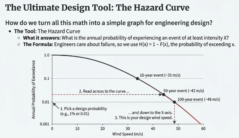
The axes:
- X-axis: Wind speed in m/s (the intensity measure, "IM"). This is the physical quantity we care about—how strong is the wind?
- Y-axis: Annual probability of exceedance (log scale!). This is H(wind speed)—the chance of exceeding that wind speed in any given year. Note the log scale: each gridline represents 10× rarer events. This lets us see both common events (10% probability) and rare events (0.1% probability) on the same graph.
How to read it—a step-by-step example:
- Pick a wind speed on the x-axis: Let's say 45 m/s (162 km/h)
- Go up to the curve: Find where the vertical line from 45 m/s hits the hazard curve
- Go left to the y-axis: Read the probability—it's approximately 0.01 (1%)
- Interpret: "There's a 1% annual probability of wind exceeding 45 m/s (162 km/h). This is a 100-year wind event."
How engineers use this:
- Decide on acceptable risk: "We want this structure to survive 100-year wind events" (1% annual failure probability)
- Read from the curve: At 1% probability, the wind speed is about 45 m/s (162 km/h)
- Design accordingly: Build the structure to withstand 45 m/s (162 km/h) winds
Typical design levels:
- 10-year design (~35 m/s / 126 km/h): For temporary structures or those easy to replace
- 50-year design (~42 m/s / 151 km/h): For typical infrastructure (e.g., distribution)
- 100-year design (~45 m/s / 162 km/h): For critical infrastructure
The Complete Picture: Connecting Everything
                    Raw Weather Data
                          │
                          ▼
        ┌─────────────────┴─────────────────┐
        │                                   │
        ▼                                   ▼
   Block Maxima                    Peaks Over Threshold
   (Annual Max)                    (All Exceedances > u)
        │                                   │
        ▼                                   ▼
   GEV Distribution                  GPD Distribution
   F(x; μ, σ, ξ)                    P(X>x | X>u)
        │                                   │
        └─────────────┬─────────────────────┘
                      │
                      ▼
              Return Levels (z_T)
              "What intensity for T-year event?"
                      │
                      ▼
              Hazard Curve H(IM)
              "Probability vs. Intensity"
                      │
                      ▼
              Engineering Design
              "Build to withstand X intensity"
Why This Matters for Climate Resilience
The real power of these methods emerges when we consider climate change:
- Historical data gives us the current GEV parameters (μ, σ, ξ)
- Climate projections tell us how these parameters might shift: μ increasing = average extremes getting worse; σ increasing = more variability in extremes; ξ increasing = heavier tails = more "surprise" extreme events
- Future hazard curves shift upward and rightward: What was a 100-year event becomes a 50-year event; Infrastructure designed for historical climate becomes under-designed
- Adaptation planning requires re-calculating return levels under future climate scenarios and upgrading infrastructure accordingly
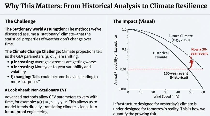
This is why power utilities need these tools—to translate climate science into concrete engineering decisions about poles, lines, substations, and system hardening investments.
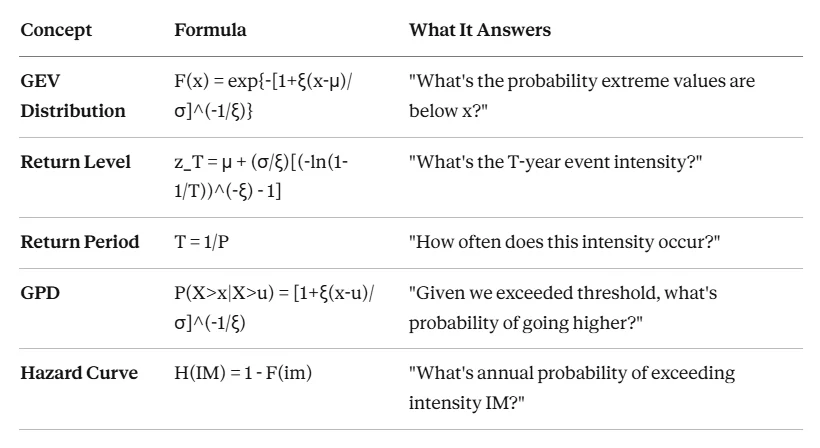
Summary: The Key Theorems
References
Foundational Texts
- Coles, S. (2001). An Introduction to Statistical Modeling of Extreme Values. Springer. — The standard textbook for extreme value methods.
- Gilleland, E., & Katz, R. W. (2016). extRemes 2.0: An Extreme Value Analysis Package in R. Journal of Statistical Software, 72(8), 1-39.
Standards and Codes
- IEC 60826:2017 — Design criteria of overhead transmission lines (international standard for reliability-based design)
- CSA C22.3 No. 60826 — Canadian adoption of IEC 60826 with climate adaptation updates
- CSA C22.3 No. 1 — Overhead systems (Canadian Electrical Code, Part III)
- NBCC 2020 — National Building Code of Canada, Climatic Information for Building Design
Wind Climate Research
- Hong, H.P., Li, S.H., & Mara, T.G. (2014). Basis for recommending an update of wind velocity pressures in Canadian design codes. Canadian Journal of Civil Engineering, 41(3), 206-221.
- Wang, X., & Li, D. (2006). The r largest order statistics model for extreme wind speed estimation. Journal of Wind Engineering and Industrial Aerodynamics, 94(5), 355-365.
Software
- R package extRemes — Comprehensive tools for GEV and GPD fitting with diagnostic plots
- Python scipy.stats.genextreme — Note: uses opposite sign convention for shape parameter (c = −ξ)
Continue to Part 2: From Historical Analysis to Climate Adaptation.