This is Part 4 of a multi-part series on Climate-Informed Asset Management for utilities. Part 0 established pole strength fundamentals. Part 1 introduced extreme value theory for single hazards. Part 2 covered climate projections and the adaptation gap. Part 3 tackled compound hazards and fragility curves. Now we address a foundational question: how do we systematically identify which of our thousands of assets are actually exposed to each climate hazard?
The Starting Question
In Parts 1-3, we developed sophisticated tools for analyzing hazards:
- GEV distributions for modeling extreme events
- Climate projections for understanding future conditions
- Copulas for capturing compound hazard dependencies
- Fragility curves for translating hazard intensity to damage probability
But all of these tools share a common assumption: we know which assets are exposed to which hazards.
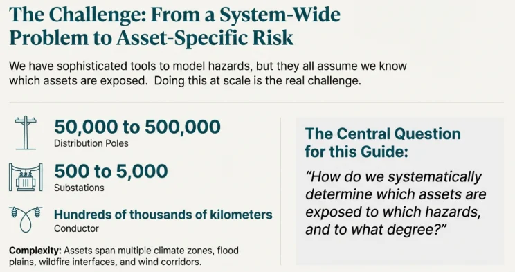
This seems obvious until you actually try to do it at scale. A typical North American electric utility has:
- 50,000 to 500,000 distribution poles
- 500 to 5,000 substations
- Hundreds of thousands of kilometers of conductor
- Assets spanning multiple climate zones, flood plains, wildfire interface areas, and wind corridors
The central question for Part 4:
How do we systematically determine which assets are exposed to which hazards, and to what degree?
This is the domain of exposure analysis—the critical bridge between hazard assessment and vulnerability assessment in the IPCC risk framework.
Note: For utility asset management, there are many risk frameworks you can use. Here we use the IPCC risk framework, since it is climate-focused analysis. As such, the risk calculation can be linked to the climate forecasting based on the IPCC framework.
Step 1: The IPCC AR6 Risk Framework
Before diving into methodology, let's establish the conceptual framework that underpins modern climate risk assessment.
The Risk Propeller
The IPCC Sixth Assessment Report (AR6) defines climate risk through the interaction of three components:
Risk = f(Hazard, Exposure, Vulnerability)
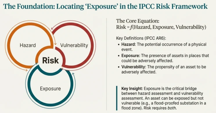
"In the context of climate change, risk can arise from the dynamic interactions among climate-related hazards, the exposure and vulnerability of affected human and ecological systems." — IPCC AR6 WGII Summary for Policymakers
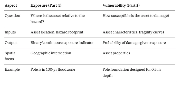
Key Insight: Exposure is distinct from vulnerability. An asset can be exposed (located in a flood zone) but not vulnerable (designed to withstand flooding). Conversely, an asset might be vulnerable (poorly maintained) but not exposed (located on high ground). Risk requires both.
Important: It is very important to fully understand the difference between hazard, exposure, vulnerability and fragility, since there are so many variables so far.
- Hazard: refers to the intensity measure of the climate event. For example wind blowing at 30 m/s, with a probability of 1%.
- Exposure: is a pole exposed to the wind blowing at 30 m/s with a probability of 1% occurrence throughout the year.
- Vulnerability: this is the physical attribute of a pole, how vulnerable a pole is; it is related to the age, design load, etc. of the specific pole.
- Fragility: when wind is blowing at a vulnerable pole (age of 55) at 30 m/s, what chance that it will be adversely damaged.
- Putting all of them together: a fragility curve transforms hazard x exposure into PoF (probability of failure) of a pole with certain vulnerability attributes.
Why Exposure Analysis Matters
Common Question: "Can't we just assume all assets in our service territory are exposed to all hazards?"
This approach fails for several reasons:
- Resource allocation becomes impossible — If everything is equally "exposed," you can't prioritize investments.
- Hazards are spatially heterogeneous — A utility serving both coastal and inland areas has dramatically different flood exposures. A utility spanning mountains and valleys has different wind exposures.
- Regulatory compliance requires specificity — Modern climate adaptation frameworks demand asset-by-location exposure assessment.
- Cost-benefit analysis breaks down — You can't calculate avoided losses without knowing which assets would have been affected.
The goal is to transform the amorphous notion of "our system is at risk" into a specific, quantifiable inventory of which assets face which hazards at what intensity thresholds.
Step 2: Defining Exposure — Binary vs. Continuous
Exposure can be measured in fundamentally different ways, each with trade-offs.
Binary Exposure: In or Out
The simplest approach treats exposure as binary: an asset is either exposed or not exposed to a given hazard.

Example: A pole is either inside a 100-year flood zone or outside it.
Advantages:
- Simple to implement and communicate
- Clear decision boundaries
- Aligns with many regulatory zone designations
Disadvantages:
- Ignores gradients (a pole 1 meter inside a flood zone ≠ a pole 100 meters inside)
- Creates artificial cliff effects at boundaries
- Doesn't capture proximity risk
Continuous Exposure: Degree of Exposure
A more sophisticated approach measures the degree of exposure on a continuous scale.

Example: The expected peak wind gust at a pole location is 45 m/s for a 50-year return period.
Advantages:
- Captures spatial gradients
- Enables precise risk calculations
- Supports optimization and prioritization
Disadvantages:
- Requires more detailed hazard data
- More complex to communicate
- May create false precision
Threshold-Based Probability: A Practical Hybrid
A pragmatic middle ground combines both approaches:
- Define asset failure thresholds (e.g., Class 4 pole fails at 70 km/h wind)
- Calculate probability of exceeding that threshold at each location
- Classify exposure by probability bins
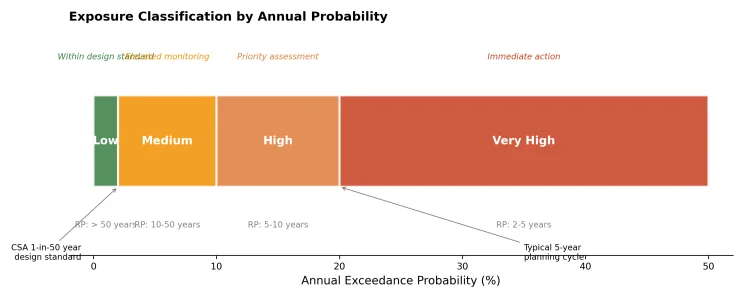
Exposure classification bins are based on annual exceedance probability, aligned with design standards (CSA 1-in-50 year) and typical planning cycles (5-year capital programs).
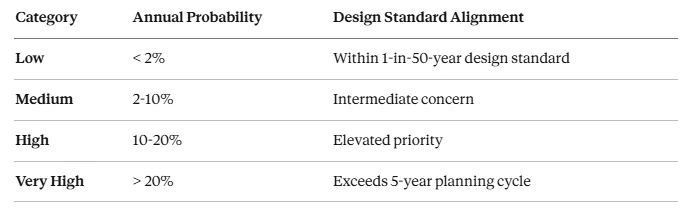
Commonly Asked Question: "Why these specific thresholds?"
The thresholds aren't arbitrary—they connect directly to engineering standards and planning horizons:
- 2% (1-in-50 years): Most utility infrastructure is designed to this return period per CSA and NESC
- 20% (1-in-5 years): If an asset faces this probability annually, you'll likely see failure within your typical 5-year capital planning cycle
Step 3: The Spatial Overlay Method — GIS-Based Exposure Analysis
The fundamental technique for exposure analysis is spatial overlay - intersecting asset locations with hazard footprints in a Geographic Information System (GIS).
The Basic Framework

Where:
- Asset_i is the geospatial representation of asset i (point, line, or polygon)
- HazardZone_h is the spatial extent of hazard h at a given intensity/return period
- ∩ denotes spatial intersection
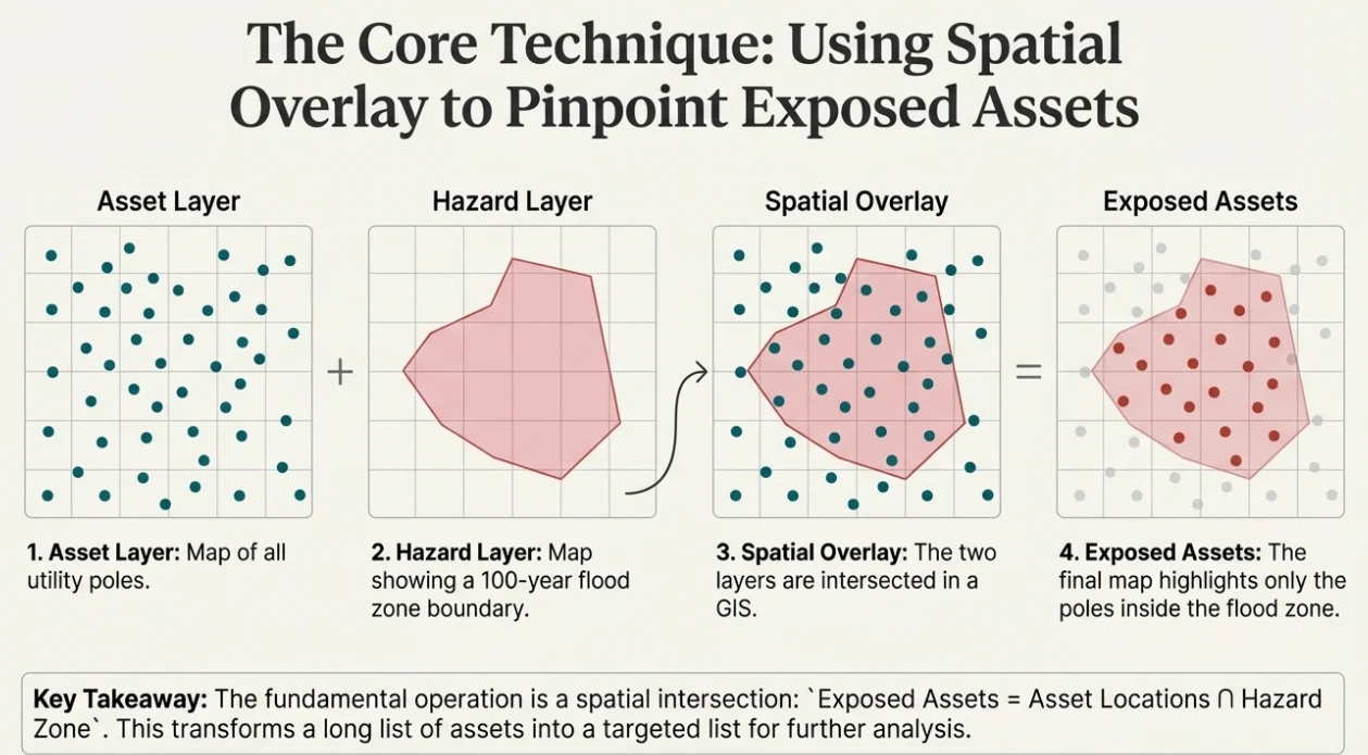
Asset and hazard layers combine through this intersection to identify exposed infrastructure, producing an asset-by-hazard exposure matrix.
Implementation Steps
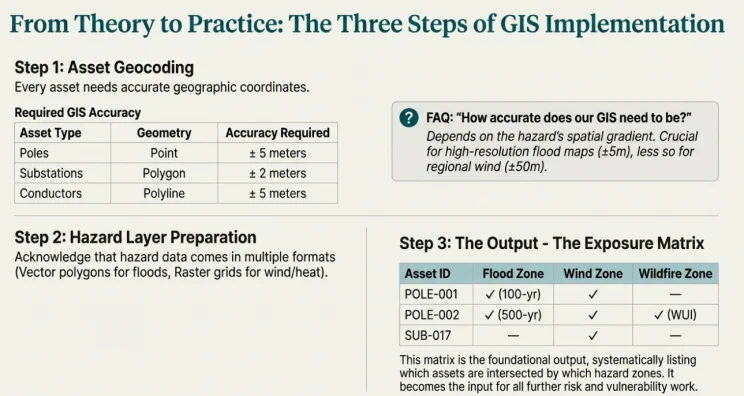
This matrix becomes the foundation for vulnerability assessment in Part 5.
Step 4: Quantifying Exposure — The Expected Annual Exposure (EAE) Framework
For many applications, we need more than just "exposed or not" - we need to quantify how much exposure an asset experiences annually.
The Core Formula
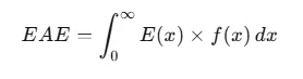
Wait - what does this actually mean?
This formula multiplies two things and integrates:
- f(x): The probability density of hazard intensity (from GEV or GPD, as we learned in Part 1)
- E(x): The exposure response at intensity x
But a critical question arises: Where does "annual" come from?
Where the "Annual" Factor Lives
The formula as written doesn't explicitly show the annual factor. It enters through one of two approaches. (A) In the Annual Maximum approach using GEV, the annual factor is implicit - f(x) models the distribution of yearly maximum values. (B) In the Peaks-Over-Threshold approach using GPD, the annual factor is explicit through λ, the mean rate of threshold exceedances per year.
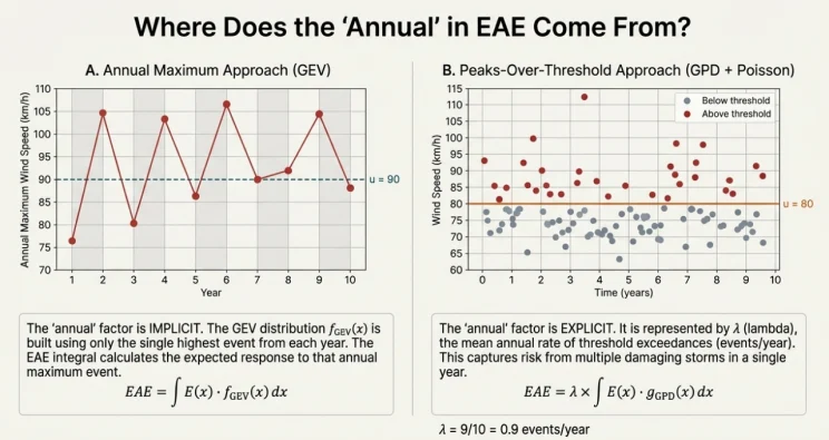
EAE Calculation Approach A: Annual Maximum Framework (GEV)
When using the Generalized Extreme Value distribution for annual maxima:
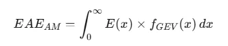
The "annual" is implicit because f_GEV models the distribution of yearly maximum intensities. The integral computes the expected value of E(X) where X is the annual maximum.
EAE Calculation Approach B: Peaks-Over-Threshold Framework (GPD)
For a more complete picture when multiple damaging events occur per year:

The "annual" is explicit through λ—the mean annual rate of threshold exceedances:
- λ has units of [events/year]
- The integral has units of [exposure/event]
- Product gives [exposure/year]
Visualizing the EAE Calculation
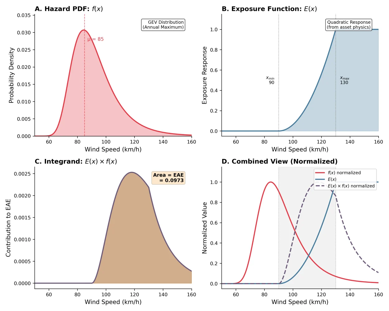
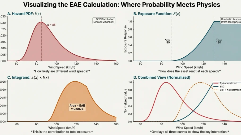
The calculation has four components. (A) The hazard PDF f(x) from the GEV distribution shows the probability distribution of annual maximum wind speeds. (B) The exposure function E(x) represents asset response at each intensity level. (C) The product E(x)×f(x) is the integrand - the area under this curve equals EAE. (D) In a combined normalized view, the peak contribution occurs where high probability meets significant response.
Step 5: Understanding E(x) — The Exposure Response Function
A Critical Clarification
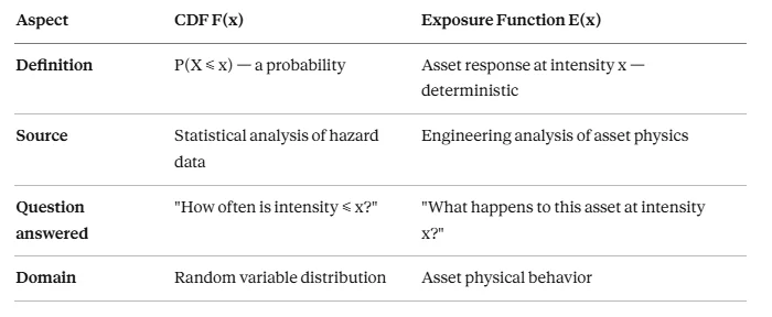
Commonly Asked Question: "Is E(x) a CDF? It goes from 0 to 1..."
No, E(x) is NOT a cumulative distribution function. This is a common misconception because both:
- Go from 0 to 1
- Increase monotonically
But they represent fundamentally different things:
Where E(x) Data Actually Comes From
Think of E(x) as the response function of a certain exposure of the pole.
E(x) data comes from engineering analysis of the asset - not from weather statistics. There are four main sources — or, you can understand them as different types of E(x):
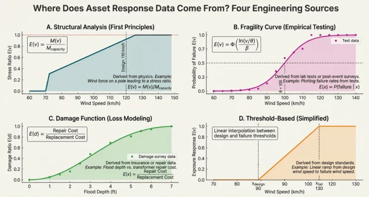
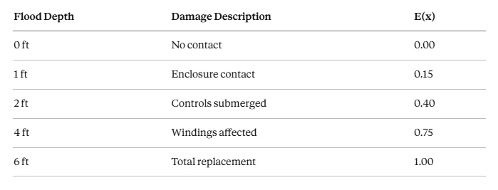
(A) Structural analysis derives E(x) from first principles - wind force, bending moment, and stress ratio calculations. (B) Fragility curves fit empirical test data to probabilistic failure functions. (C) Damage functions translate flood depth (or other intensity) to repair cost ratios from historical claims. (D) Threshold-based approaches use simplified linear interpolation between design and failure points.
Source 1: Structural/Physical Analysis (First Principles)
For a wood pole under wind loading, we can derive E(x) from physics:
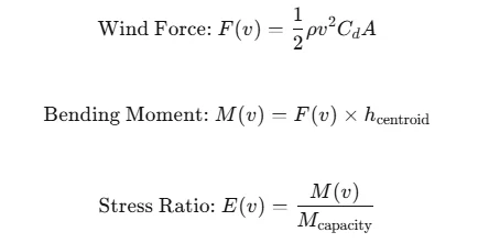
Worked Example — Class 4 Distribution Pole:
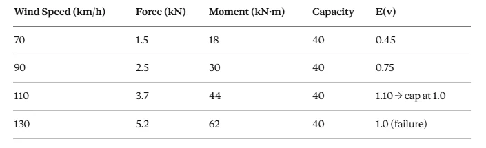
The exposure function emerges naturally from the physics of wind loading.
Source 2: Fragility Curves (Empirical/Testing)
From laboratory testing or post-storm damage surveys:
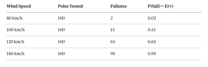
Fit a fragility curve (typically lognormal CDF):
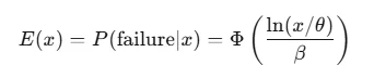
Important Nuance: This uses a CDF mathematically, but it's the CDF of the asset's capacity distribution, not the hazard distribution. It answers "what fraction of assets fail at intensity x?"
Source 3: Damage Functions (Loss Modeling)
From insurance claims or damage assessments:
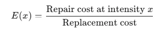
Flood Depth-Damage Example for Pad-Mounted Transformer:
Source 4: Threshold-Based (Simplified Engineering)
Based on design standards, with linear transition:

Comparing Different E(x) Forms
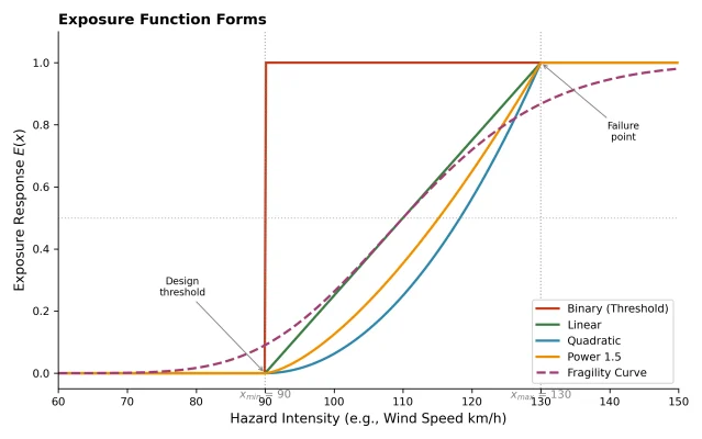
The exposure function can take several mathematical forms. Binary (threshold) functions suit regulatory compliance questions. Linear provides a first approximation. Quadratic is appropriate for wind (since force ∝ v²). Power 1.5 fits ice accumulation effects. Fragility curves capture probabilistic failure with uncertainty in asset capacity.
- x-axis: Hazard intensity (wind speed, flood depth, ice thickness, etc.)
- y-axis: Exposure response (0 = no effect, 1 = full effect/failure)
- x_min (design threshold): Intensity below which asset experiences no stress
- x_max (failure point): Intensity at which asset reaches failure/full exposure
- Curve shape: Determined by asset physics and failure mode
Step 6: Discrete Approximation of EAE
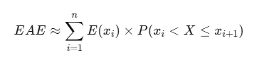
In practice, we often can't compute the integral analytically. The discrete approximation is:
What Do These Terms Mean?
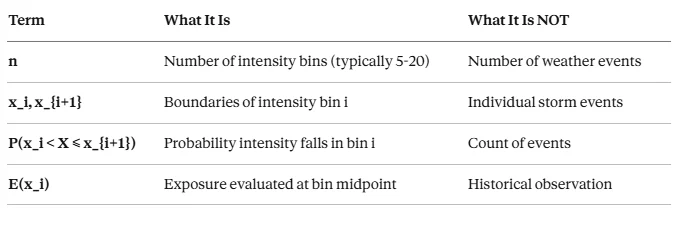
Commonly Asked Question: "What is n? What are x_i and x_{i+1}?"
Let's clarify each term:
Commonly Asked Question: "Where is 'annual' in the discrete form?"
For the POT approach, you must multiply by λ:

Where:
- λ = annual rate of threshold exceedances [events/year]
- P(...) = conditional probability from GPD
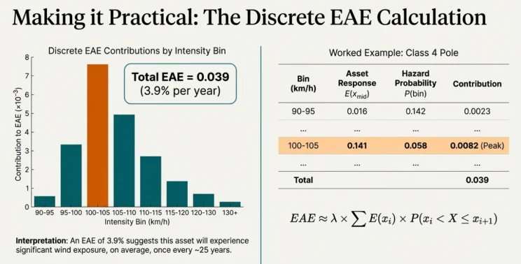
Worked Example: Wind EAE Discrete Calculation
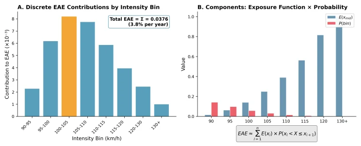
In the discrete approximation, each intensity bin contributes E(x_mid) × P(bin), and the sum of the bin contributions equals the total Expected Annual Exposure.
Example:
Asset: Class 4 pole, design wind 110 km/h
GEV Parameters: μ = 85 km/h, σ = 12 km/h, ξ = 0.05
Exposure form: Quadratic, x_min = 90, x_max = 130 (as such, we define/set 90-130 km/h wind to be the extreme/significant wind exposure range, then the EAE calculation will give us the probability of occurrence in a year; inversely, it is the return level of the extreme wind. The same idea as Period = 1/Frequency.)
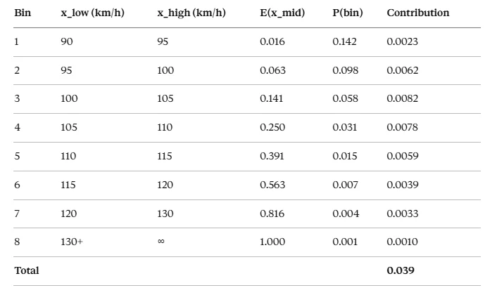
Interpretation: EAE ≈ 3.9%, meaning significant wind exposure occurs roughly once every 25 years on average.
In summary:
Step 7: Multi-Hazard Exposure Analysis
Exposure Count: How Many Hazards?
The simplest multi-hazard metric counts how many hazard zones intersect each asset:
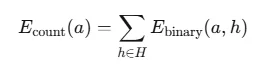
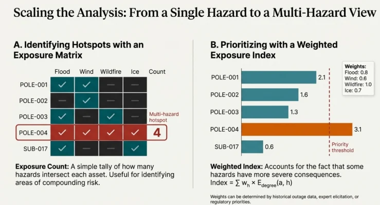
The exposure matrix shows binary exposure status for each asset-hazard combination, with the exposure count tallied. Assets exposed to 3+ hazards are multi-hazard hotspots.
Weighted Exposure Index
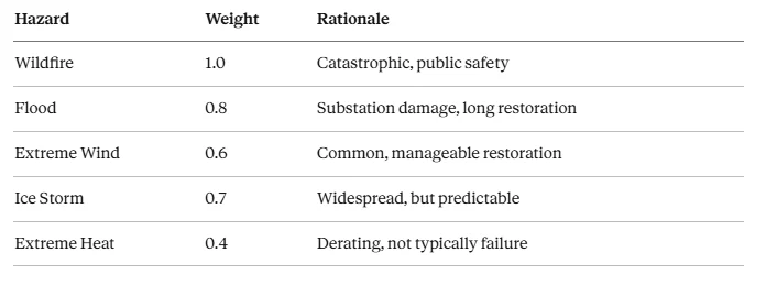
Different hazards have different consequences. Weight them accordingly:

A weighted exposure index accounts for different hazard severities - for example, wildfire weighted 1.0 vs. wind at 0.6 - to prioritize assets for assessment.
Weight Determination Methods:
- Historical Attribution: Analyze past outages by cause
- Expert Elicitation: Delphi method with engineering staff
- Regulatory Priority: Higher weights for compliance-critical hazards
- Consequence-Based: Weight by typical repair cost × outage duration
Example Weight Assignment:
Step 8: Geographic Boundary Considerations
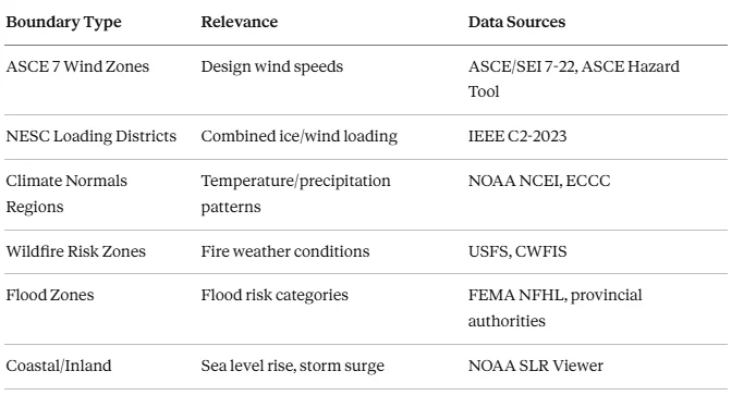
Climate hazards vary systematically across geographic regions. North American utilities should consider climate zones and regions, NESC loading districts, and natural boundaries.
Climate Zones and Regions
NESC Loading Districts
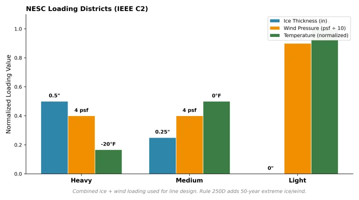
NESC (IEEE C2) loading districts define combined ice and wind loading for line design across the continental US. Heavy loading (northern regions) specifies 0.5" radial ice with 4 psf wind at -20°F. Light loading (southern/coastal) specifies no ice but higher 9 psf wind. Rule 250D adds 50-year return period extreme ice/wind combinations.
Natural Boundaries Matter
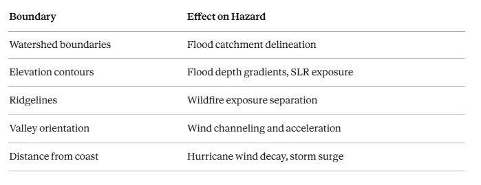
Commonly Asked Question: "Our service territory spans multiple climate zones—how do we handle this?"
Options:
- Zone-based analysis: Segment assets by climate zone, apply appropriate parameters to each
- Interpolation: For gradual transitions (wind, temperature), interpolate between zone values
- Conservative approach: Apply the more severe zone's parameters to border areas
- High-resolution data: Use gridded climate data that captures spatial gradients
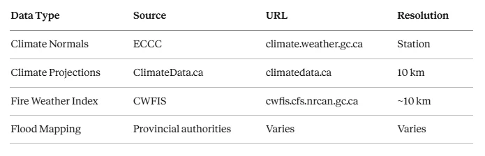
Step 9: Data Sources for North American Utilities
Canadian Sources
United States Sources
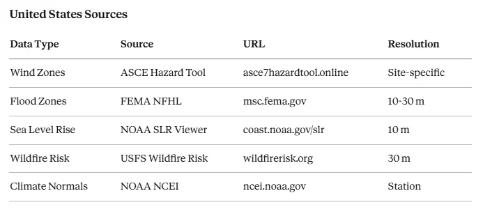
Canadian and United States hazard data sources are catalogued in detail in the companion appendix: North American climate and hazard data sources.
Step 10: Handling Uncertainty
Types of Uncertainty
Aleatory Uncertainty (Natural Variability):
- Climate hazards are inherently stochastic
- Even perfect models can't eliminate this
- Managed through: Probabilistic frameworks, confidence intervals, return period ranges
Epistemic Uncertainty (Knowledge Gaps):
- Climate model disagreement
- Hazard map errors and outdated data
- Asset location imprecision
- Managed through: Ensemble approaches, sensitivity analysis, data quality improvement
Quantifying Uncertainty
For climate projections: Use ensemble statistics
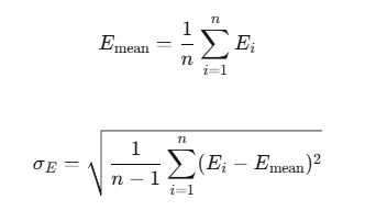
Where E_i is the exposure calculated from climate model i.
For spatial data: Apply Monte Carlo analysis.
Perturb asset locations within their uncertainty bounds and recalculate exposure.
Step 11: Connecting Exposure to Vulnerability Assessment
Exposure analysis is a precursor to vulnerability assessment - not a replacement for it.
The Exposure-Vulnerability Distinction
Preparing for Part 5
The exposure analysis outputs directly feed vulnerability assessment:
Exposure Analysis Outputs:
- List of exposed assets per hazard
- Hazard intensity at each exposed asset location
- Exposure probability/frequency (EAE)
Part 5 Will Add:
- Asset-specific fragility curves
- Condition-adjusted vulnerability
- Failure probability calculations
Complete Risk Equation (Preview):

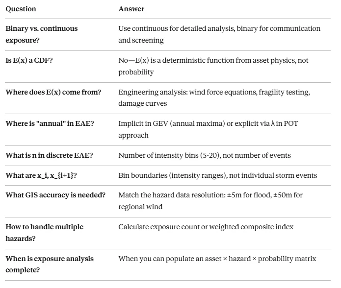
Summary: Commonly Asked Questions
Key Takeaways
- Exposure is the bridge between hazard characterization and vulnerability assessment in the IPCC risk framework.
- Spatial overlay is the core technique - intersecting asset locations with hazard footprints using GIS.
- E(x) comes from engineering, not statistics - it represents asset physical response, derived from structural analysis, fragility testing, or damage functions.
- The "annual" in EAE enters either implicitly (GEV models annual maxima) or explicitly (λ = events/year in POT approach).
- Discrete approximation divides intensity into bins, sums E(x)×P(bin), and multiplies by λ if using POT.
- Multi-hazard exposure requires consideration of exposure counts, weighted indices, and compound hotspots.
- Geographic boundaries matter — climate zones, watersheds, administrative areas all influence exposure patterns.
- Uncertainty must be acknowledged and quantified through ensemble approaches and sensitivity analysis.
References
IPCC Framework
- IPCC (2022). Climate Change 2022: Impacts, Adaptation and Vulnerability. Working Group II Contribution to AR6.
- IPCC (2021). "The concept of risk in the IPCC Sixth Assessment Report: A summary of cross-Working Group discussions."
Industry Frameworks
- EPRI (2024). Climate Hazard and Exposure Assessment Guidance for Power System Applications. Climate READi.
- EPRI (2024). Climate 101: Hazard, Exposure, and Vulnerability Assessment. Report 3002028735.
- DOE (2016). Climate Change and the Electricity Sector: Guide for Climate Change Resilience Planning.
Research Papers
- Hawchar, L., et al. (2020). "A GIS-based framework for high-level climate change risk assessment of critical infrastructure." Climate Risk Management, 29, 100255.
- Karagiannakis, S., et al. (2025). "Fragility Modeling of Power Grid Infrastructure for Addressing Climate Change Risks and Adaptation." WIREs Climate Change.
Data Sources
- FEMA National Flood Hazard Layer. https://www.fema.gov/flood-maps/national-flood-hazard-layer
- ASCE/SEI 7-22 Minimum Design Loads and Associated Criteria for Buildings and Other Structures.
- NOAA Climate Mapping for Resilience and Adaptation (CMRA). https://resilience.climate.gov
- ECCC Climate Data Portal. https://climatedata.ca
- USFS Wildfire Risk to Communities. https://wildfirerisk.org
Standards
- CSA C22.3 No. 1 — Overhead Systems
- IEEE C2 (NESC) — National Electrical Safety Code
See also the two appendices to this article: North American climate and hazard data sources and EAE, climate PoF, and the CNAIM framework.